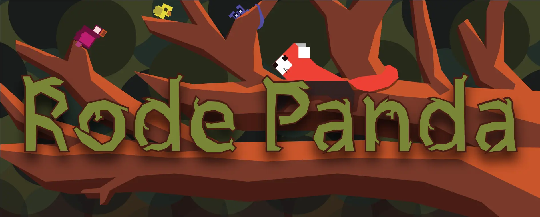
Rode Panda
Of course, I designed and programmed this website myself!
This is actually “version 2” of the portfolio. It borrows the good elements from v1, but made some huge changes.
The biggest changes were:
- A custom font (the header font) I designed myself => wanted to do it for version 1, ran out of time
- A grid on the front page => draws the eye, better overview of all my work, easy to pick one you like
- Much more diversity in colors and graphics => just looks better and more playful
- Much less text and navigation => the old version had loads of explanations and bits of text for each page, project, subcategory, you name it
- Switched to a static website under the hood => much faster, easier to maintain, the future of the internet (in my humble opinion)
This article explains the changes and development in Dutch:
These articles talk about “version 1” (how I designed it, the idea behind it, etc.) in Dutch:
As the articles show, I had many ideas/mockups for the website. But the design I chose just had the best “nature” and “red panda” vibe to it. It was the most playful and vibrant. (As much as I love a good, clean, modern looking design … it just doesn’t fit my personality and my projects.)
Besides that, I love a good challenge. This website—with the many visual elements, responsive grids, custom fonts—was certainly a challenge.
